Work /
The Parklands of
Floyds Fork
A Community Project That Makes us Proud
Overview
The Parklands of Floyds Fork is now one of the largest metropolitan parks in the country, but it wasn’t always that way. When we first started talking with them, they were merely a road cutting through a few fields and a big dream. They wanted a website that was not only easy to use, but helpful, just like a tour guide. We proposed a website that could learn about a user and offer suggestions. They ultimately chose to work with us because they needed a custom-designed content management system and a complex Google Maps overlay. We gave ‘em that and more.

The Problem
A Complex Content Challenge
A park this size needed a content management system capable of handling the massive amount of information. The Parklands had plans for lots of events, classes and other activities, but did not have any way to present these opportunities to potential visitors. They also needed a complex map that could interact with a standard third party GPS, such as Google Maps. All of this data also meant their website would need to integrate a considerable amount of data through APIs.

The Solution
Exploring the Data and Finding Answers
We developed a proprietary CMS that adapts and adjusts to each user’s preferences and selections when searching the park. The CMS interacted seamlessly with users, anticipating what they were looking for and making recommendations along the way. Oh, you’re looking for the children’s water park? Well, that’s nearby to the Learning Center, give it a try. And since you like water, you might also be interested in kayaking. Oh, you’ll need to know how to get there. Check out this Google Map with an interactive overlay that outlines unique features in the park.
We’re proud of our work on this project, which provides the community with a web experience that is almost as explorable and unique as the park. The Google Maps overlay was and still is an incredibly cool and uncommon interaction with a digital map. It showcases aspects of the park that aren’t typically searchable in a standard maps listings, such as parking, trailheads, paddling access points, welcome centers, etc.
"We wanted to create a website that was as explorable as the park itself."
The utility of the site didn’t stop there.
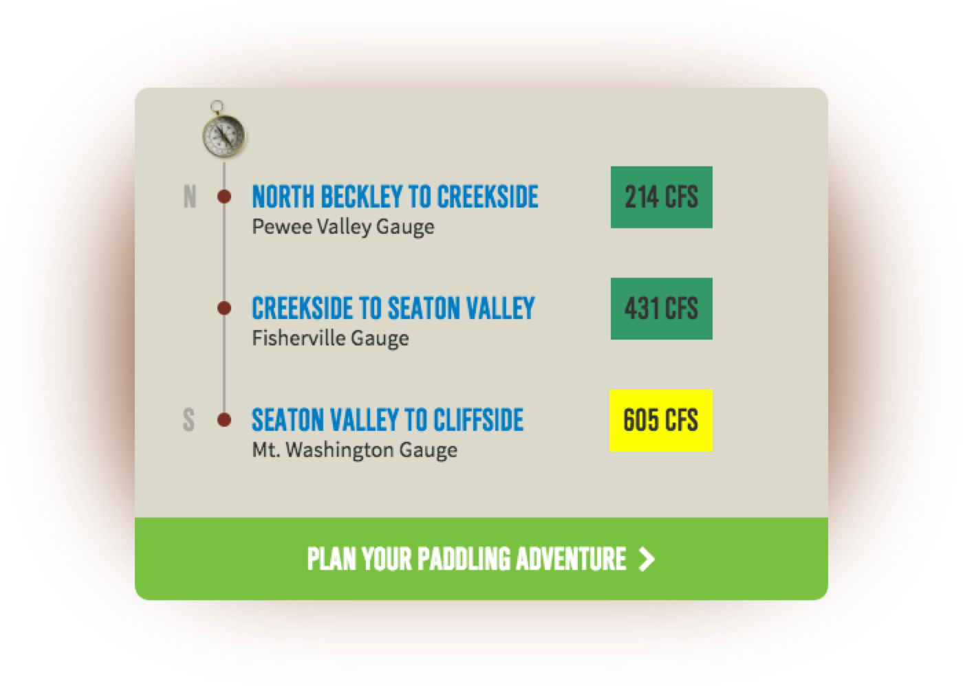
The park was dedicating a lot of resources into building canoe and kayak launch points. But if you’re a paddler, you know there’s nothing worse than loading up your boat and hitting the water, only to figure out the water levels are too low or too high (even scarier). Typically finding the water levels means searching the United States Geological Survey’s website for a stream’s cubic feet per second (CFS), and in the location you’re going to paddle. But the search typically yields too much information, multiple locations and it’s hard to decipher. If you’re a paddling newb, then you may not know the difference between 200 CFS and 2,000 (hint: one is a comfy float, the other is flood status). We built a color coded CFS system with a description of what the metrics mean for The Parklands specifically. This removed the guesswork for new paddlers and made it easier to find for pros.
Alright, enough about the park from us. Here’s a word about this project from the client.
“We’re thrilled to have a new website centered around the user experience. A park the size of The Parklands needs a great website to help tell its story. We think this is one of the best park websites out there.”
The Numbers
This site doesn’t just look good.
It performs.
-
81%
-
1m+
-
84%